Graphic Recording, Infographics and Illustration - What’s the Difference?
Looking at your 100-page report with glazed eyes, you may be wondering how you can add more visuals to the work and make it more appealing. Not only do images help break up the walls of text, they do a few things to aid our digestion of information.
We think in pictures and while reading text can present those pictures in our mind, it is open for interpretation. Having an image accompany your text allows the viewer to grasp the concepts specifically. But how should that information be displayed? Well, that would be up to a consultation with me about your specific project, that I would be more than happy to hear about!
Here are 4 basic examples of how information can be displayed. I have used my favourite subject “Chickens” to help explain my process:
Live Graphic Recording
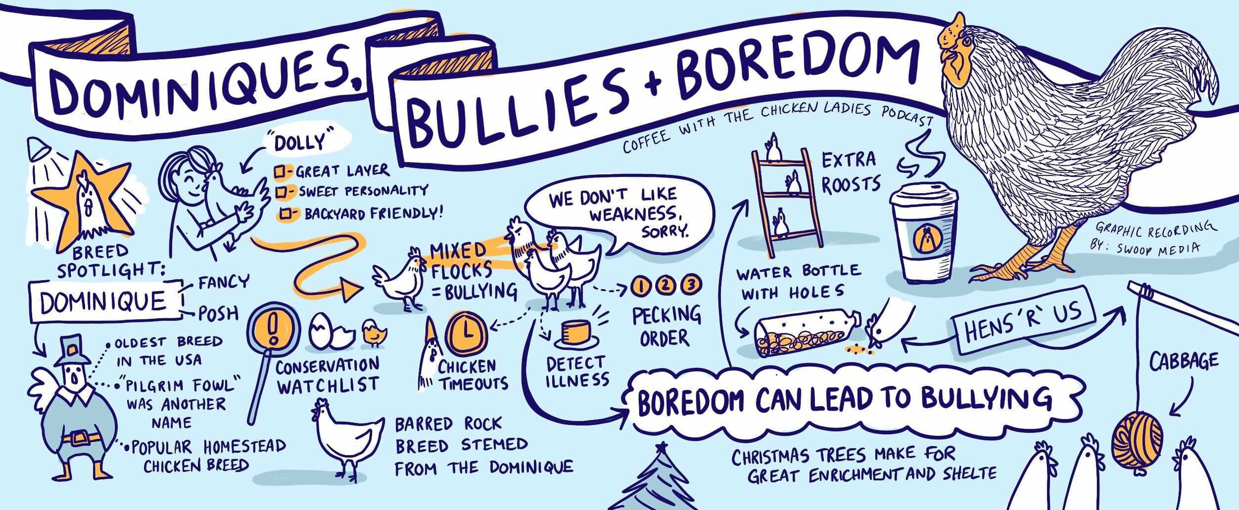
“Dominiques, Bullies & Boredom” is a podcast episode by Coffee With the Chicken Ladies. This live graphic recording was done by listening to the podcast, and illustrating the important concepts and tidbits that came out of the conversation. This is done quickly, and can be completed day-of.
Best times to use graphic recording: conferences, workshops, podcasts, webinars, keynotes, panel discussions, strategic meetings, community building sessions, and fireside chats.

Infographic/Design
“Anatomy of a Chicken” is an infographic displaying where and what parts are on a chicken. For an infographic, you will need information previously gathered to start. Next, analyzing that data is crucial and asking the right questions to work through it. “What story are we going to tell?” “Who will be the viewers of the infographic?” “How can we introduce hierarchy to the information?” Once that information is sorted out that infographic can be designed to help that information get across easier, and more efficiently.
Best times to use an infographic: statistics, reports, document design, strategic planning, social media, explanations, custom templates and strategic summaries.
Info-based Illustration
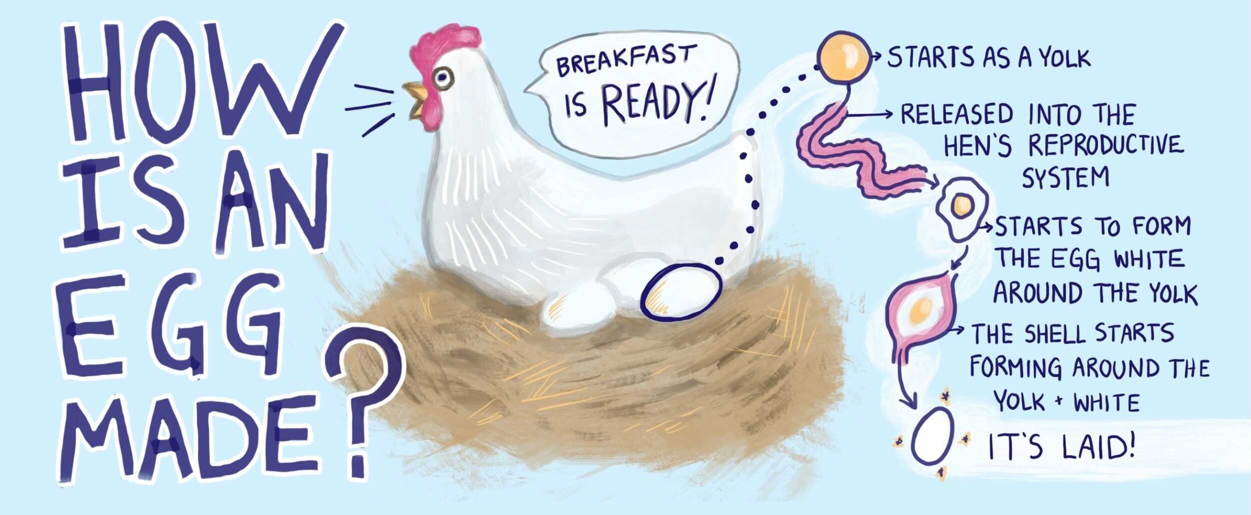
Illustration can be used two ways, narrative art or information-based art. This example shown as “How is an Egg Made?” is more on the information side of things. This illustration is showing the very basics of how an egg is formed with more pictures than words.
Best times to use an info illustration: journey maps, illustrated reports, powerpoint presentation, storytelling, and education.

Narrative Illustration
Narrative style illustration has to be the most fun, and it can be used in any situation where a photograph would be. It doesn’t have to be all play, no work -the possibilities are truly endless!
Best times to use an illustration: custom illustrated graphics for social media, label work, conceptual work, personalized gifts, story telling with characters, news and media posts, and using imagery to get powerful messages across.
Hopefully this post inspires you to bring more visuals into your work, and help open up the lines of communication for your current project. Thanks for reading and I hope you have an egg-cellent rest of your day! (I couldn’t do a chicken post without a pun- I’m not a monster)
Doodle on!